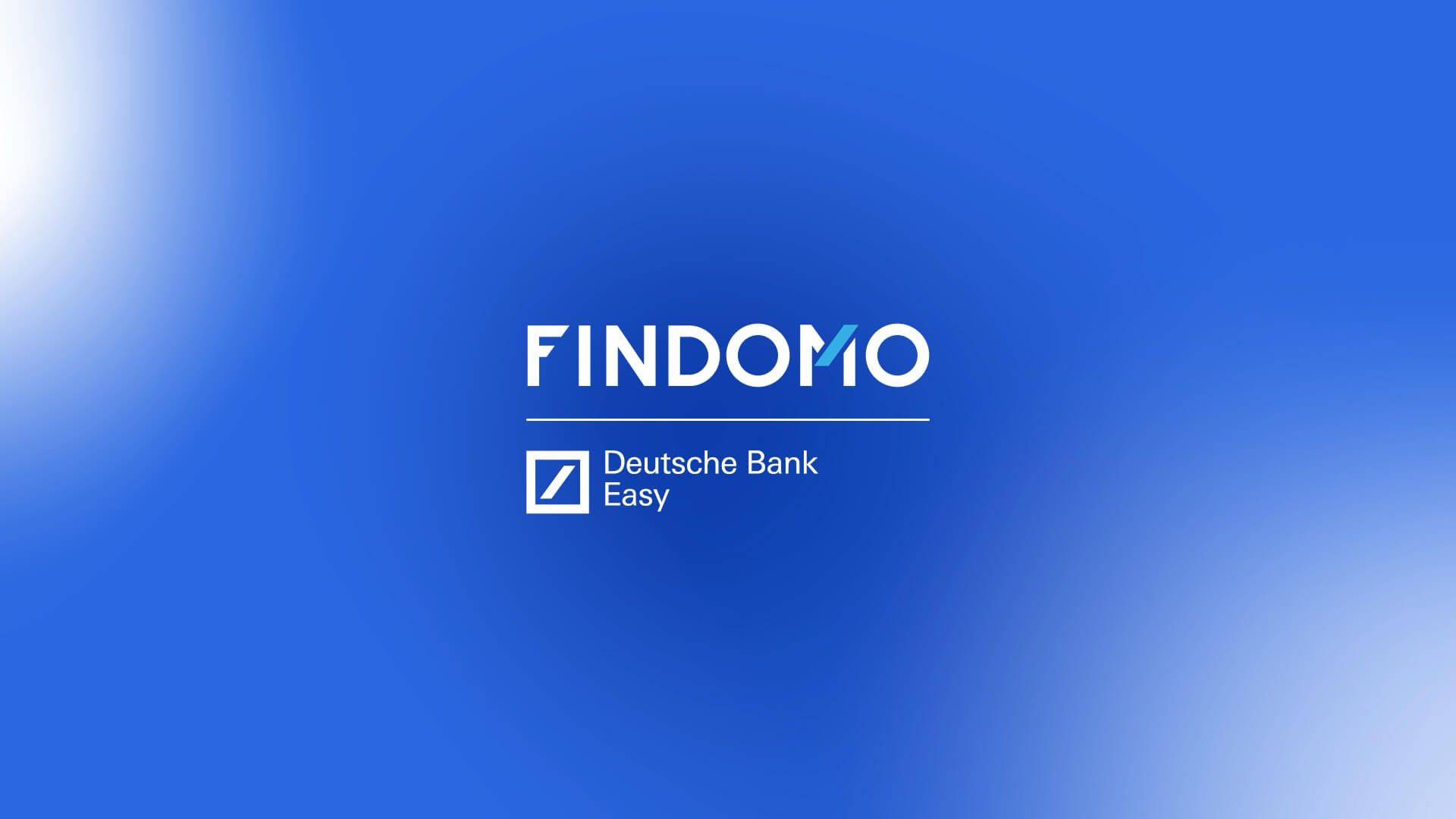
Findomo is a long-standing player in the credit sector, a trusted local point of reference, and a Deutsche Bank Easy dealer.
What we do
BrandingGraphic designPhoto and videoSocial mediaweb design
The Project
The challenge was twofold: on one hand, to strengthen Findomo’s identity as a financial advisor close to people; on the other, to clearly and coherently define its hierarchical relationship with the bank without losing authority or recognizability.
Objectives:
• Define the visual hierarchy between Findomo and Deutsche Bank Easy.
• Align the brand with the bank’s values while maintaining an independent voice.
• Make communication more human and relationship-oriented.
• Support the business with more effective digital tools.
Objectives:
• Define the visual hierarchy between Findomo and Deutsche Bank Easy.
• Align the brand with the bank’s values while maintaining an independent voice.
• Make communication more human and relationship-oriented.
• Support the business with more effective digital tools.
The starting point
The project began with a strategic analysis:
• Competitor analysis: study of hierarchies, tone of voice, and visual systems to identify a distinctive space.
• Internal survey: gathering insights from the team to align identity, internal culture, and external communication.
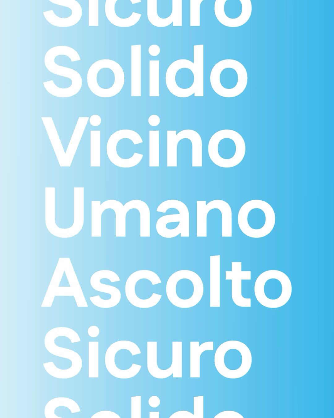
The analysis led to a clear guiding concept:
Deutsche Bank Easy represents solidity. Findomo represents closeness.
• Competitor analysis: study of hierarchies, tone of voice, and visual systems to identify a distinctive space.
• Internal survey: gathering insights from the team to align identity, internal culture, and external communication.
The analysis led to a clear guiding concept:
Deutsche Bank Easy represents solidity. Findomo represents closeness.
Solution
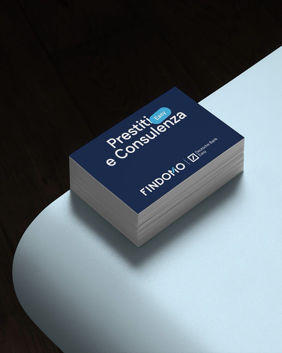
Logo & Identity:
• Logo as a declaration of hierarchy, with Findomo in the spotlight and Deutsche Bank Easy as a mark of guarantee.
• Visual integration with Deutsche Bank’s distinctive elements.
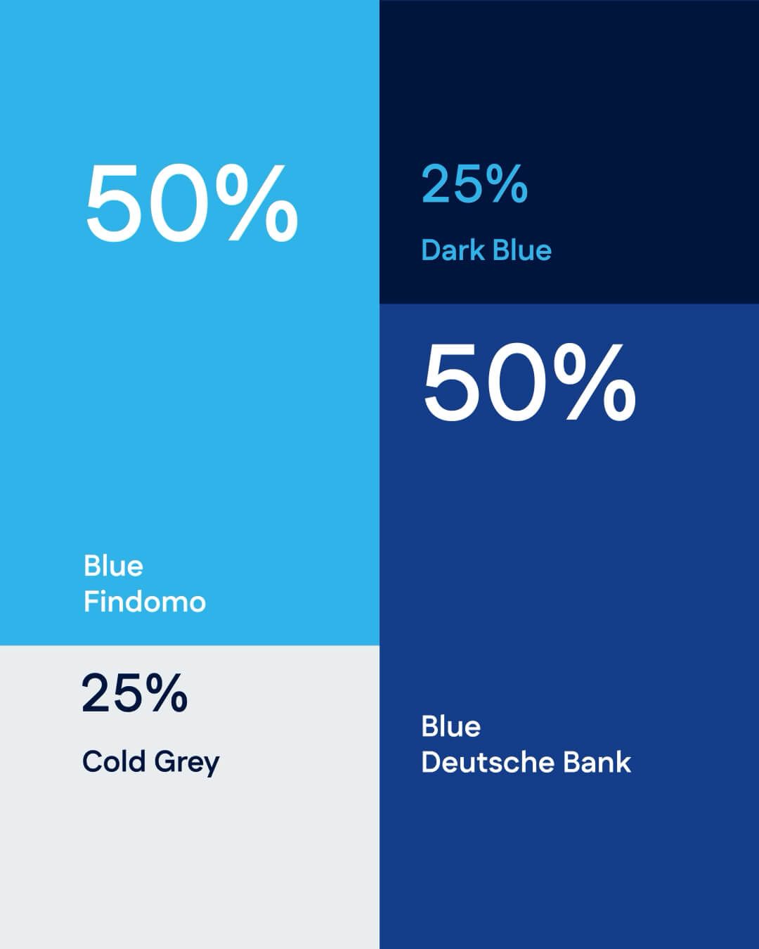
• Color palette aligned with the DB brand, with more contemporary accents.
• Clean, legible, and institutional typography.
• Logo as a declaration of hierarchy, with Findomo in the spotlight and Deutsche Bank Easy as a mark of guarantee.
• Visual integration with Deutsche Bank’s distinctive elements.
• Color palette aligned with the DB brand, with more contemporary accents.
• Clean, legible, and institutional typography.

Solution
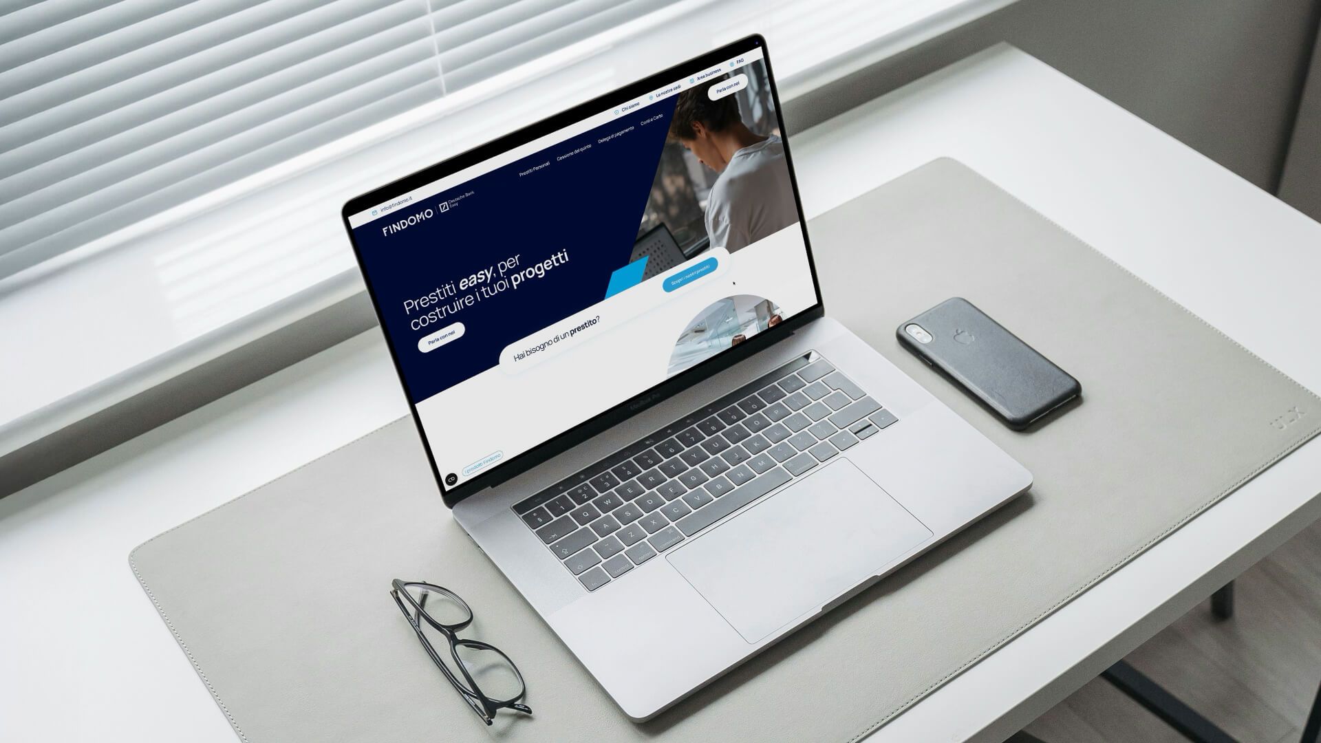
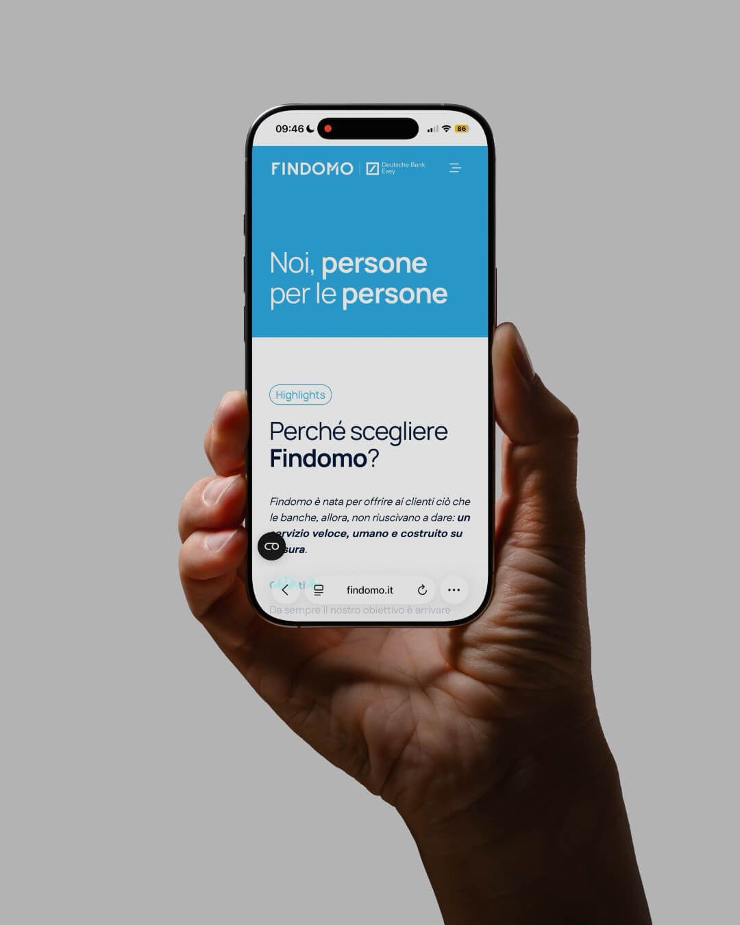
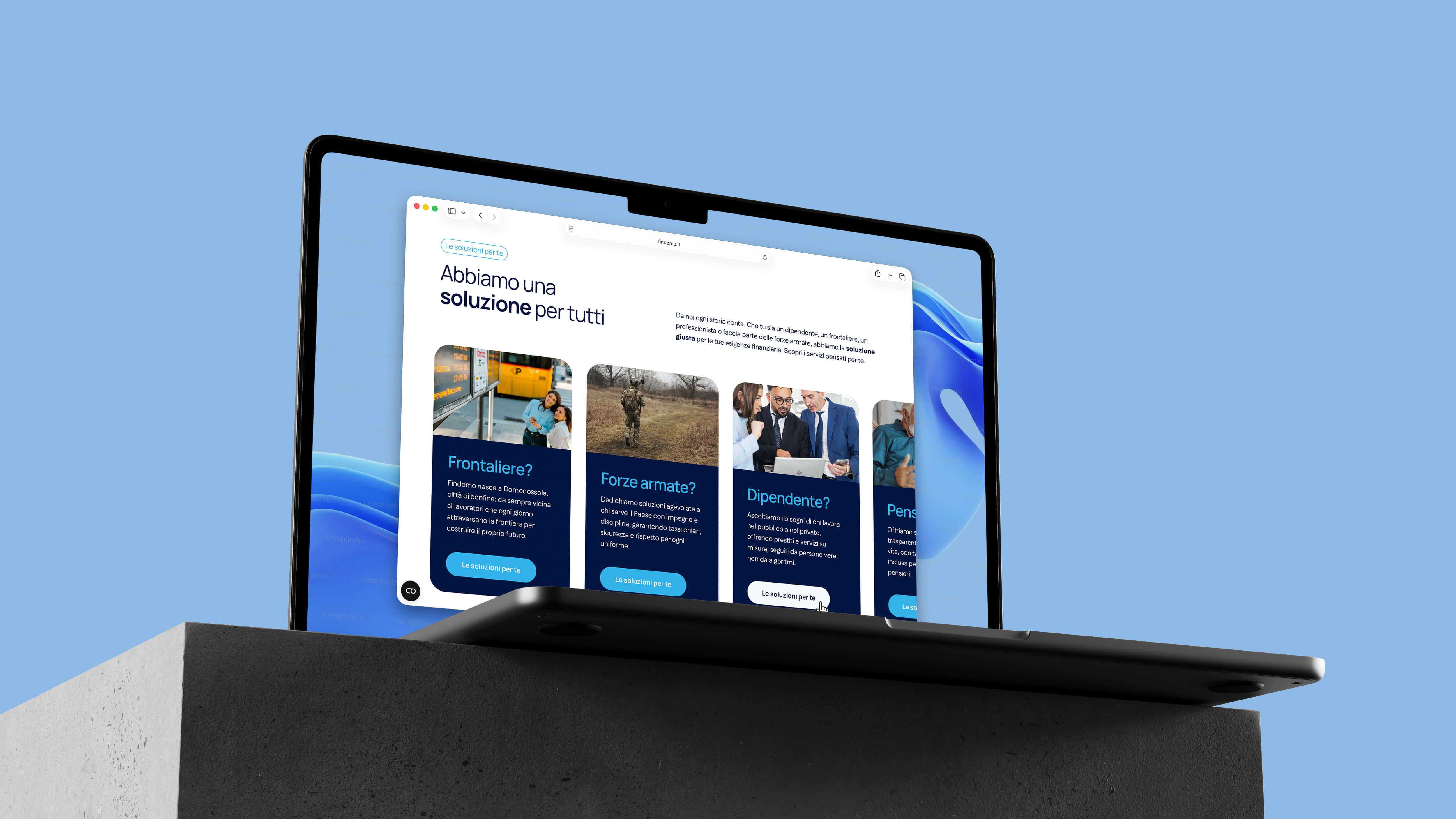
Website:
• Clear architecture and messaging tailored to the needs of the target audience.
• Highlighting Findomo’s advisory role.
• Smooth integration of the Deutsche Bank Easy brand.
• Clear architecture and messaging tailored to the needs of the target audience.
• Highlighting Findomo’s advisory role.
• Smooth integration of the Deutsche Bank Easy brand.
Solution
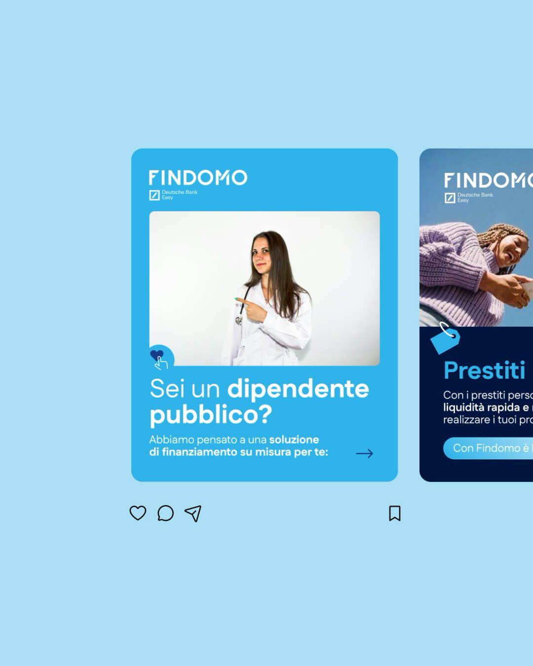
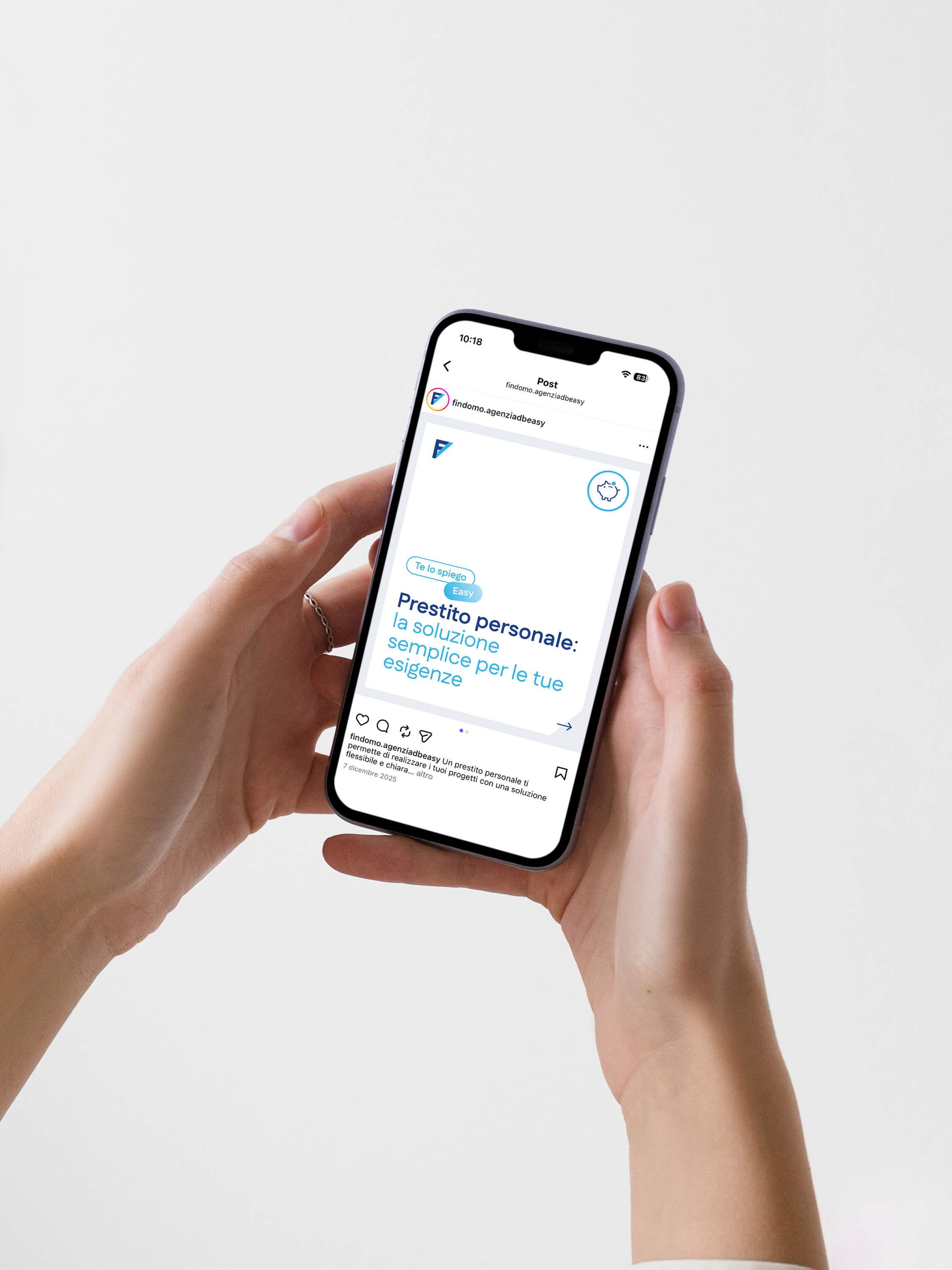
Shooting:
• Real people and authentic contexts to showcase the human side of financial advisory.
• Real people and authentic contexts to showcase the human side of financial advisory.

Result
A brand that is clearer, stronger, and more recognizable.
An identity that brings order, declares hierarchy, and builds long-term value.
Communication that is ready to support Findomo’s future growth, without losing its connection to the local community and the people it serves.
An identity that brings order, declares hierarchy, and builds long-term value.
Communication that is ready to support Findomo’s future growth, without losing its connection to the local community and the people it serves.